Clippers Barbershop
Started with two friends who grew up together, loving going to the barbershop and getting a fresh cut for the weekend. It wasn’t just about going in the shop and getting a cut, but rather the experience you get from being in a barbershop, conversating in a safe place and being comfortable. They wanted to create a shop where the customers could feel confident that they would receive excellent service and a comfortable space.
Categories
Branding
My Role
I was tasked to rebrand one of the shops under the L’Atelier building on East Hastings, Vancouver. The shop was previously a salon but was quite old in branding and styling. This would be re-branded, overhauled in direction and converted into a barbershop. The barbershop name, and graphic elements such as patterns, ads, merchandise, and signage were part of my design deliverables.
Project Market
The barbershop market is one where many shops in the past would often not care about their branding. Part of the new direction was to also consider how to branch out one’s clientele further. The barbershop’s target audience is difficult because they have many customers walking through their doors daily. You never know what someone is coming in for. Is it their weekly haircut, are they coming in for a special occasion, do they want a custom design, maybe they just want a shave. For these many variables, I decided to stick with a simple, yet clean look which is consistent throughout the branding.
Constraints
- The shop had to be some sort of salon or barbershop
- Couldn’t use more than two typefaces (Logo is an exception)
- 2-3 Pantone colours
- It had to be located under the L’Atelier building in East Hastings, Vancouver
Fulfillment of Requirements
Overall, the design decisions I made were tailored to create a brand identity that can be used consistently and targets a wide range of customers. A lot of the choices made use many straight edges, to show the precision that barbers have to have when working with their customers. They have to be focused in order to achieve the look that the customer is imagining.
Programs Used
- Illustrator
- Photoshop
Logo
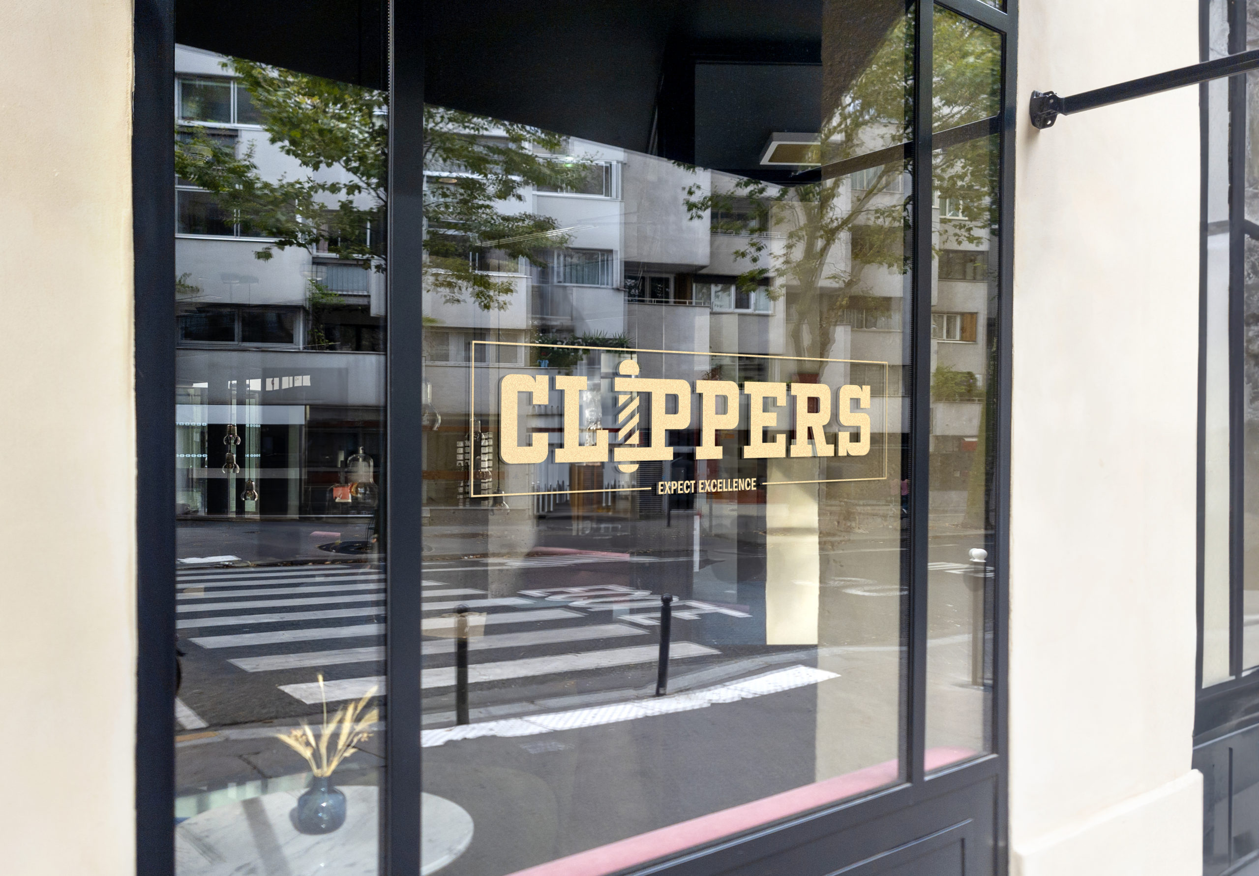
Coming up with this logo, I wanted to implement something related to a barbershop and include the name so it is easily recognizable. I decided to use a barber pole as an indication of a barbershop. Then, adding the shop’s name, Clippers, to the logo emphasizes the logo, which conveys the traditional barbershop. The typeface used for the logo is Kegger, it was chosen because it contained big blocky edges which can be seen from a distance which also helps in legibility and recognition.

Colours
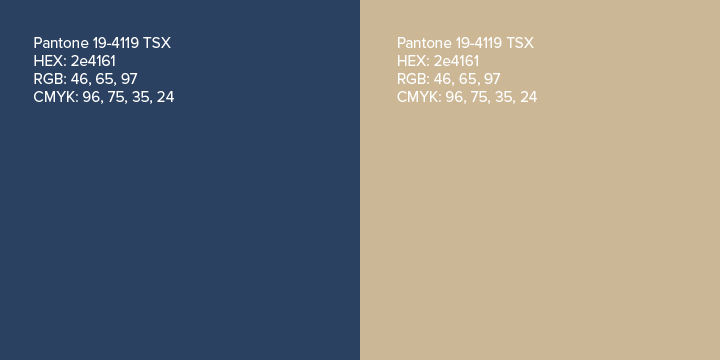
For color, I decided to go with two Pantone options that complement each other well. The blue I chose is PANTONE 19-4119 TSX, which is a darker navy blue which contrasts nicely with lighter colours. I used this colour to convey feelings of importance, reliability, and stability. A customer requires their barber to be reliable for them to be a returning customer. A stable business is built on the importance of how the company conducts itself as a whole.
For the second color, I chose to go with PANTONE 14-1118 TPG, which is a beige color that sits nicely on top of darker colors like the blue I chose. This colour was chosen because it conveys feelings of comfort and warmth. Clippers is a place where people get haircuts and can feel comfortable and relaxed.
Typography
For my headers and subheads, I decided on the typeface Franklin Gothic. This typeface was used because it has a square appearance and a broad base, which gives it a modern feel and look. – For my body copy, I chose the typeface Proxima Nova. I used this typeface because it has a variety of different styles that can be used in a variety of ways. The shapes and proportions of the letters are also very consistent and can be easily read

Graphic Elements
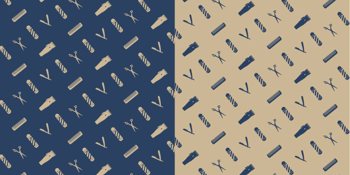
Along with the logo, a graphic element was something that was necessary. I decided to go with a pattern because patterns can be repeated into multiple branded materials such as merchandise, uniforms, barber capes, boxes, and packaging. The pattern includes the four main tools that a barber uses consistently. It’s laid out in a cris cross pattern, relating to the quilted stitching on a barber’s chair.
Service Advertisement
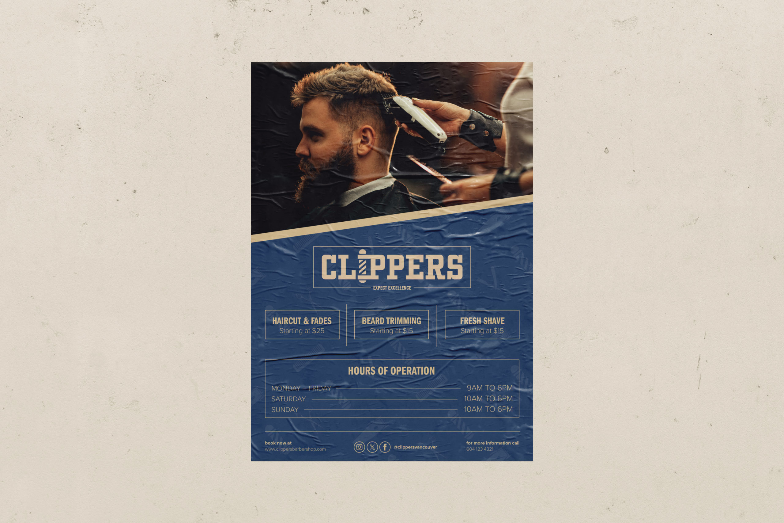
This poster advertisement was created to be posted around the city of Vancouver so that locals can see the services of the Clippers barbershop. Their socials were also added for people that are interested in visiting or just viewing their work.
Stationary
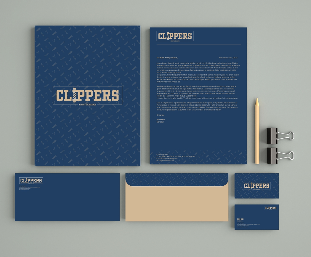
A simple business stationary for Clippers is a way of conveying a sense of legitimacy and professionalism. It also ties their brand image within the stationary utilizing their typography, colours, logo, and pattern.
Promotional Kit Box
Promotional Kit
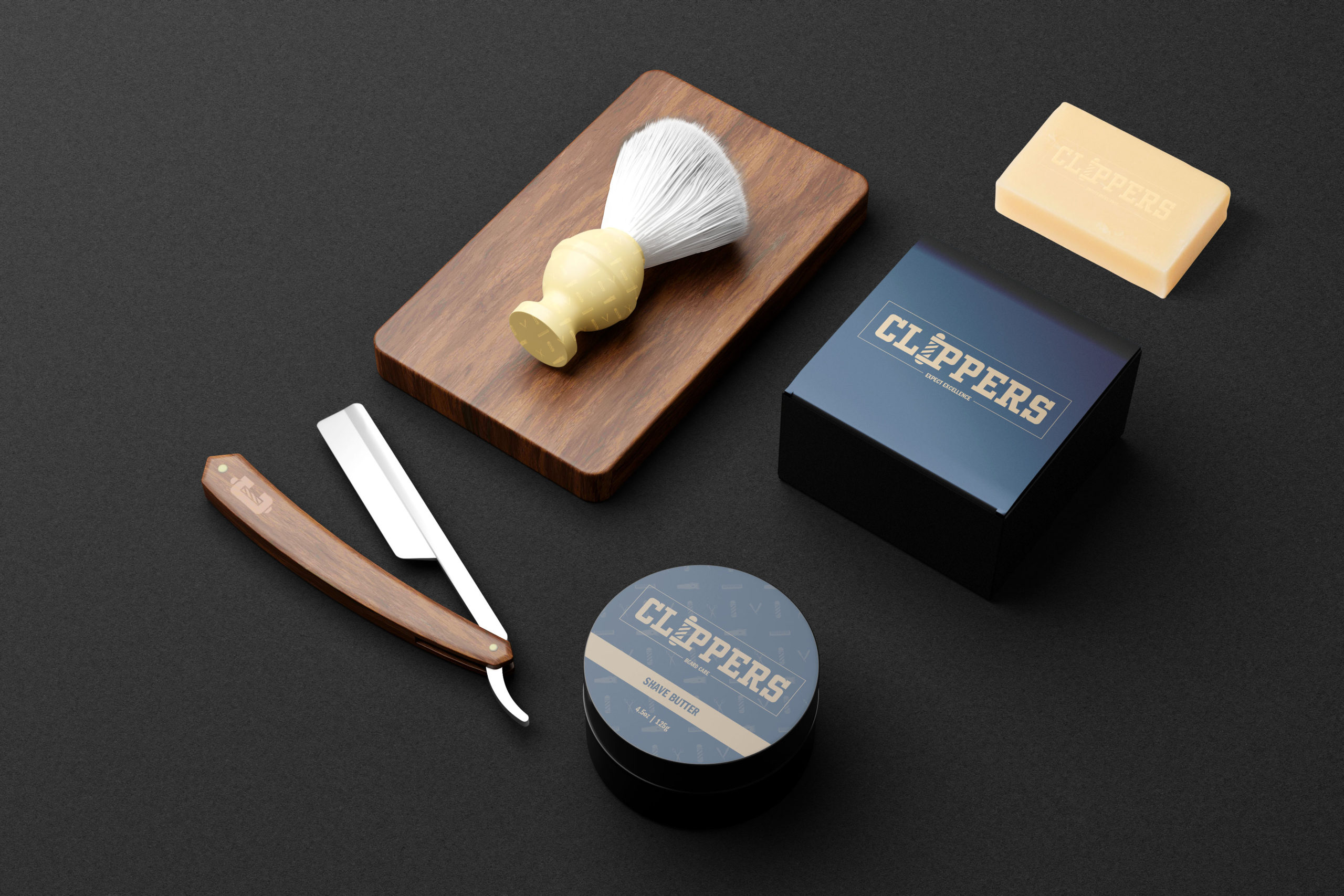
A promotional kit for the customer is a great way to attract new customers, retain existing ones, and raise awareness of the barbershop. Using branded products helps the customers remember the brand and creates a sense of loyalty.
Sandwich Board
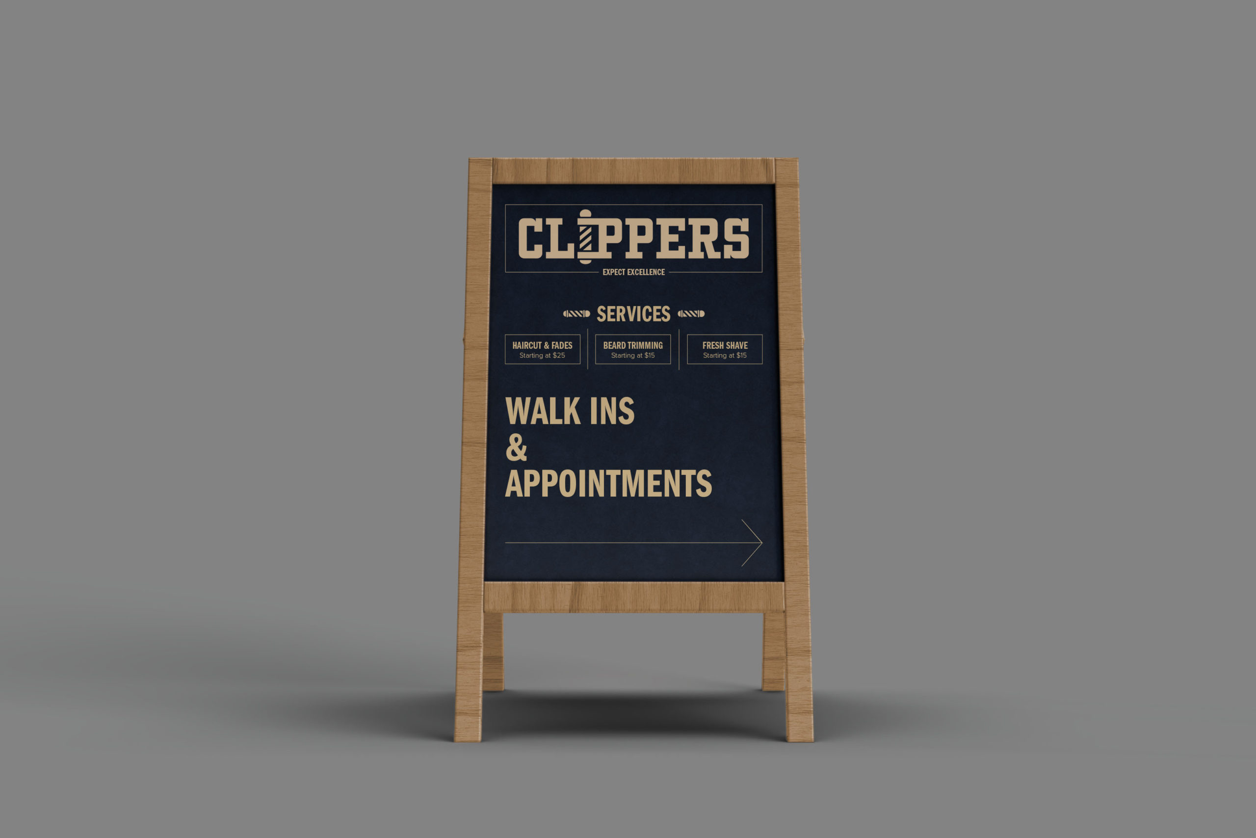
This sandwich board would be placed in front of the barbershop to inform locals about their services and that the business accepts both walk-ins and appointments.
