Blooming Florists
Blooming Florists is a floral shop that is committed to providing all floral needs to their customers. They specialize in various services such as floral arrangements, silk arrangements, extensive gift lines, and décor. They are dedicated to bringing smiles and joy through the beauty of flowers.
Categories
Branding
My Role
My task was to rebrand a local business which I was fairly familiar with. My goals in this project were to take the old branding and re-style it in a way to make it feel clean, modern, and timeless. The needs of this brand were a new logo, typography, colours, graphic elements such as patterns, and advertisements. These were all deliverables of this project.
Constraints
- Small business
- Established for over 10 years
- Targets multiple audiences
Fulfillment of Requirements
The decisions made throughout this project created a brand which is clean, modern, and cohesive. Soft colours were used throughout this project to convey feelings of purity, kindness, and happiness. Many similar elements were used in the designs so that locals can be reminded of the shop. Overall, the brand identity which was created is timeless and can be applied for success.
Programs Used
- Illustrator
- Photoshop
Logo
The logo is comprised of a lotus flower paired with The Seasons typeface. The lotus flower represents purity, perseverance, and balance. As a lotus flower rises, the petals open up without any stains. Blooming Florists want to open their arms to all customers and have genuine and pure interactions with them. The logo is also see through indicating the business is honest and authentic. At Bloming Florists, perseverance is achieved because of the commitment to complex tasks and the ability to complete them with flying colours. They represent balance through the business being skilled in a multitude of areas. The typography compliments the lotus flower because of it’s variety in strokes and it’s crisp edges making it an elegant typeface for the logo.
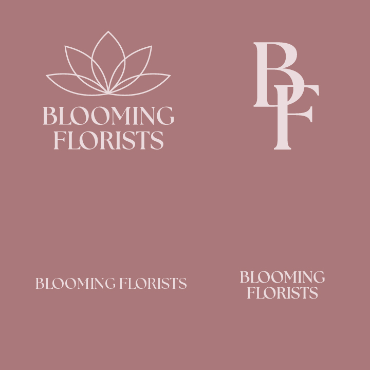
Logo Variations
Colours
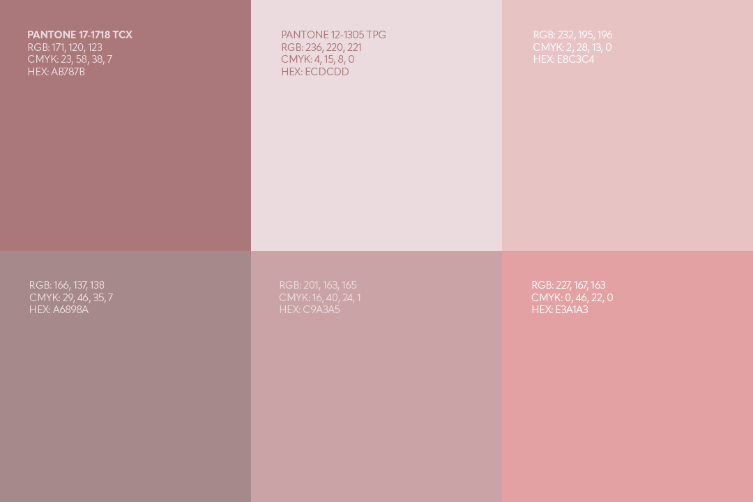
Pantone 17-1718 TCX, also known as “Dusty Rose” was chosen because it is a positive emotional colour which relates to care and kindness. This relates to the business because they want to communicate in a positive and kind manner. They also ensure that their products are handled with care and fine detail.
Pantone 12-1305 TPG, also known as “Heavenly Pink” was chosen because it is a calming colour associated with love, calmness, and purity. Blooming Florists wants to convey that they are passionate florists and that every order is special to them. They reflect love through the care and details that go into their products and services. People want to feel calm and relaxed when coming to their shop and this colour reflects that.
Typography
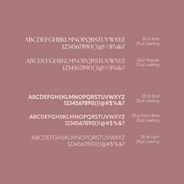
The seasons typeface was chosen due to it’s high contrast which makes it easy to read from a distance. It’s edges and variety in strokes make it an elegant typeface suited for Blooming Florists. It has a large family making it applicable in many ways. For the brand, I decided to stick to two weights out of the family to retain consistency. This typeface would be used for headings and titles.
The Apparat typeface was chosen because of it’s crisp strokes and simple geometric shapes. It is modern and easy to read. Three weights of this typeface are used for the brand making the application of it easy to remember. The bold and semi-bold weight of this typeface would be used for subheadings, body copy, and quotes.
Graphic Elements
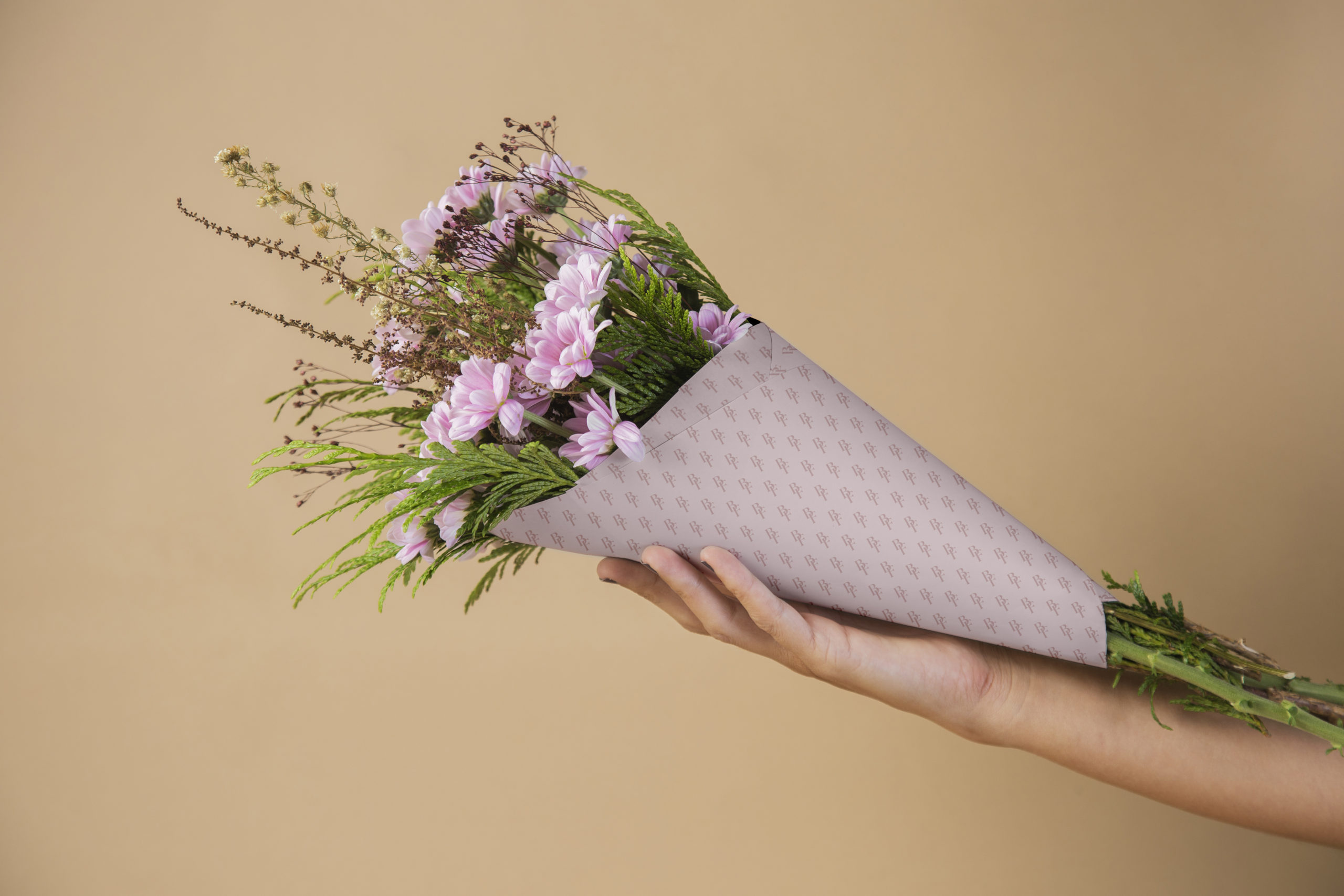
For the graphic elements, I came up with three patterns which can be used in various applications. These applications include bouquet paper, tote bags, aprons, and also throughout their stationary. The patterns all include something to remember the brand by such as their symbol, their initials, colours, and their typography.

Instagram Square Advertisement
This Instagram square advertisement would be used to promote and savings or deals Blooming Florists would be offering. In this case, I enlarged the 30% to shift the viewers eye towards it to spark interest.

Instagram Story Advertisement
An Instagram story advertisement is a quick and effective way for Blooming Florists to promote their beautiful flowers and the deals they are having.

Ceiling Banner Advetisement
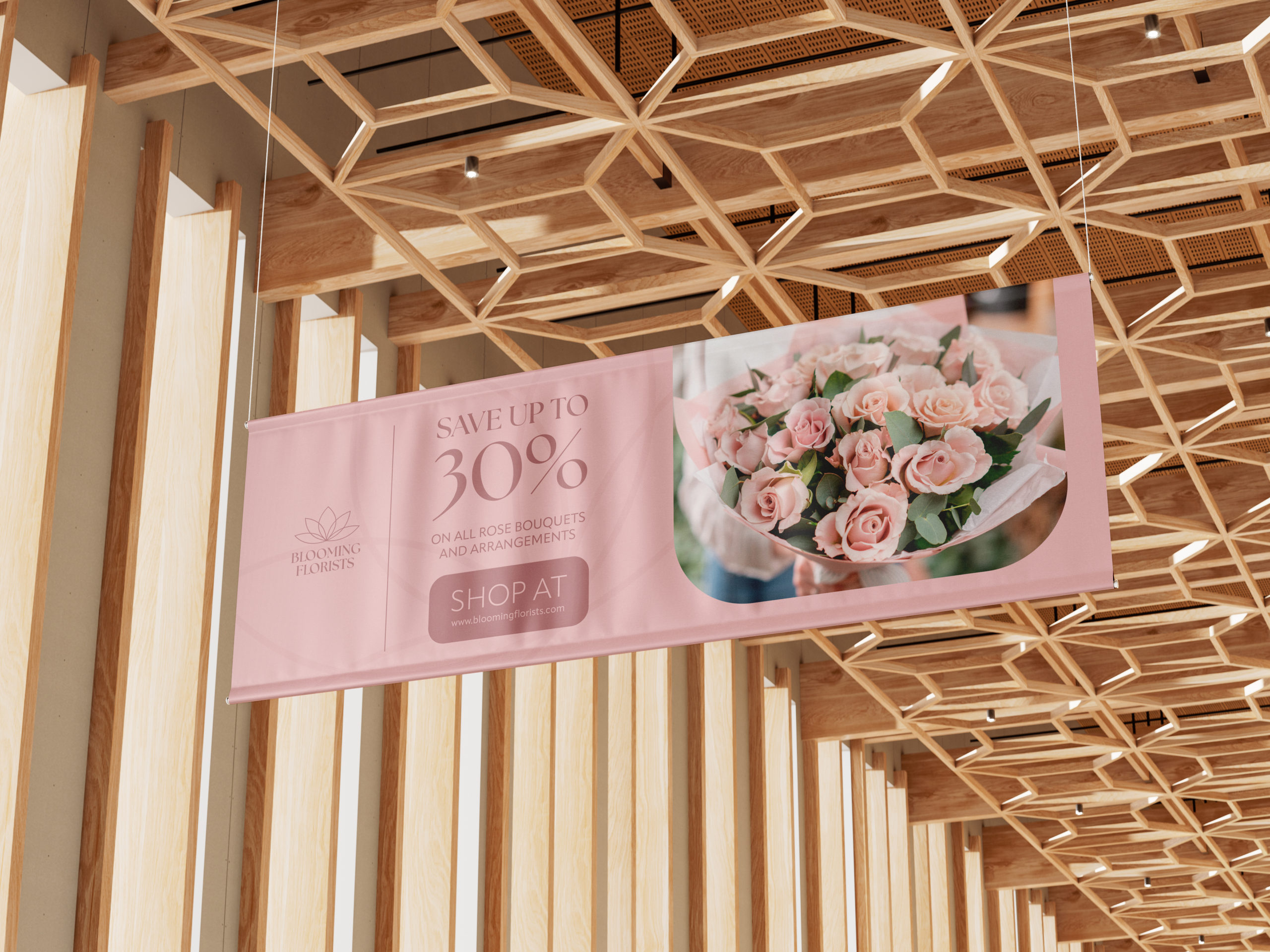
This banner would be placed inside stores or shopping malls in the Surrey area as a way to promote products and gain recognition through their colours and logo.
Instagram Square Advertisement
This square advertisement is a way for the business to communicate that they also do bigger services such as decor which require a consultation. Making it free would attract potential customers to visit the website or find out about the shop.

Instagram Story Advertisement
This story advertisement is the same as the square post, but utilizes slightly different colours to increase contrast for the text and the gradient.

Ceiling Banner Mockup
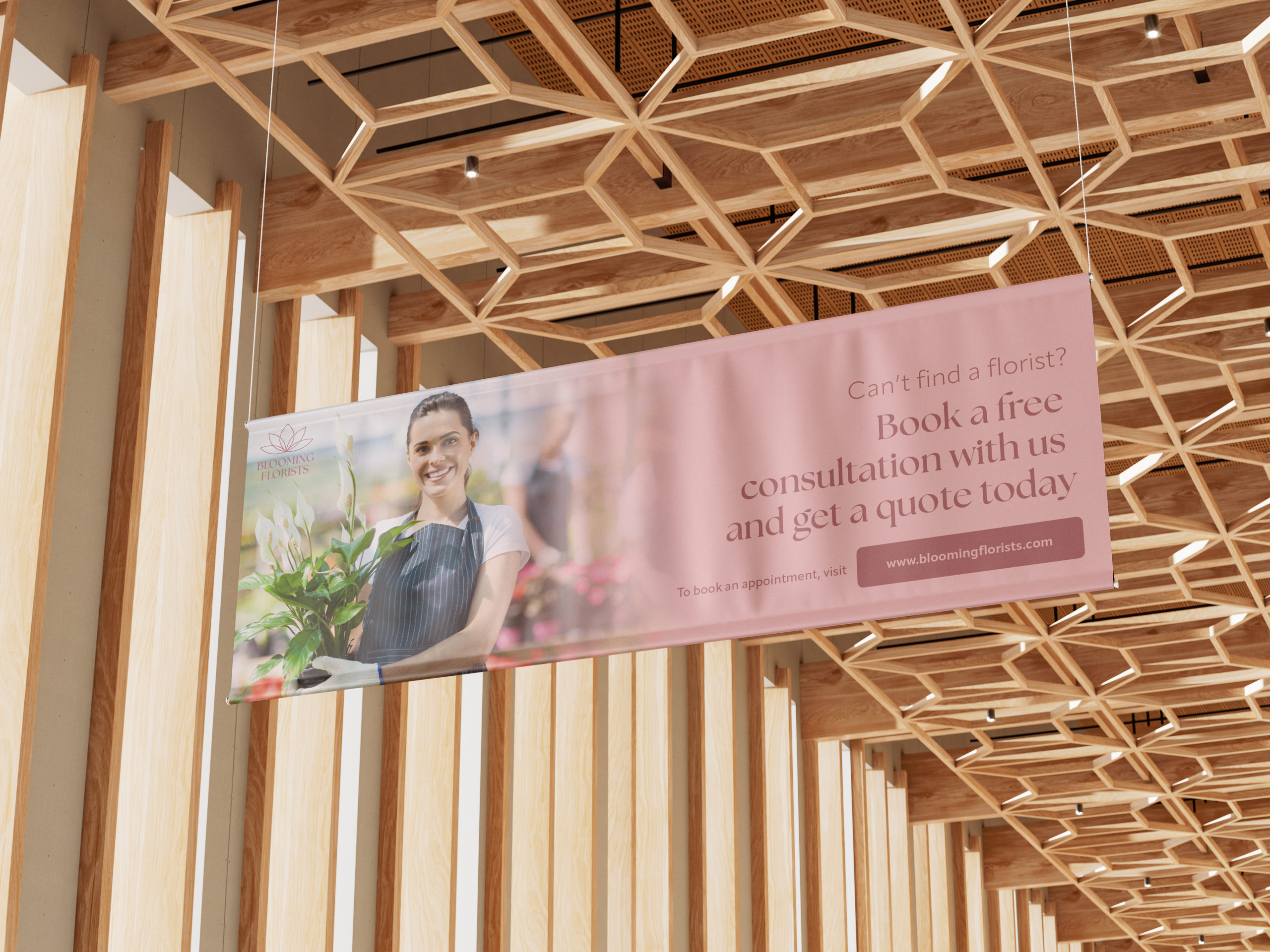
A ceiling banner for this particular advertisement is great because it raises recognition of the brand and promotes its more premium services at an enlarged scale.
Stationary
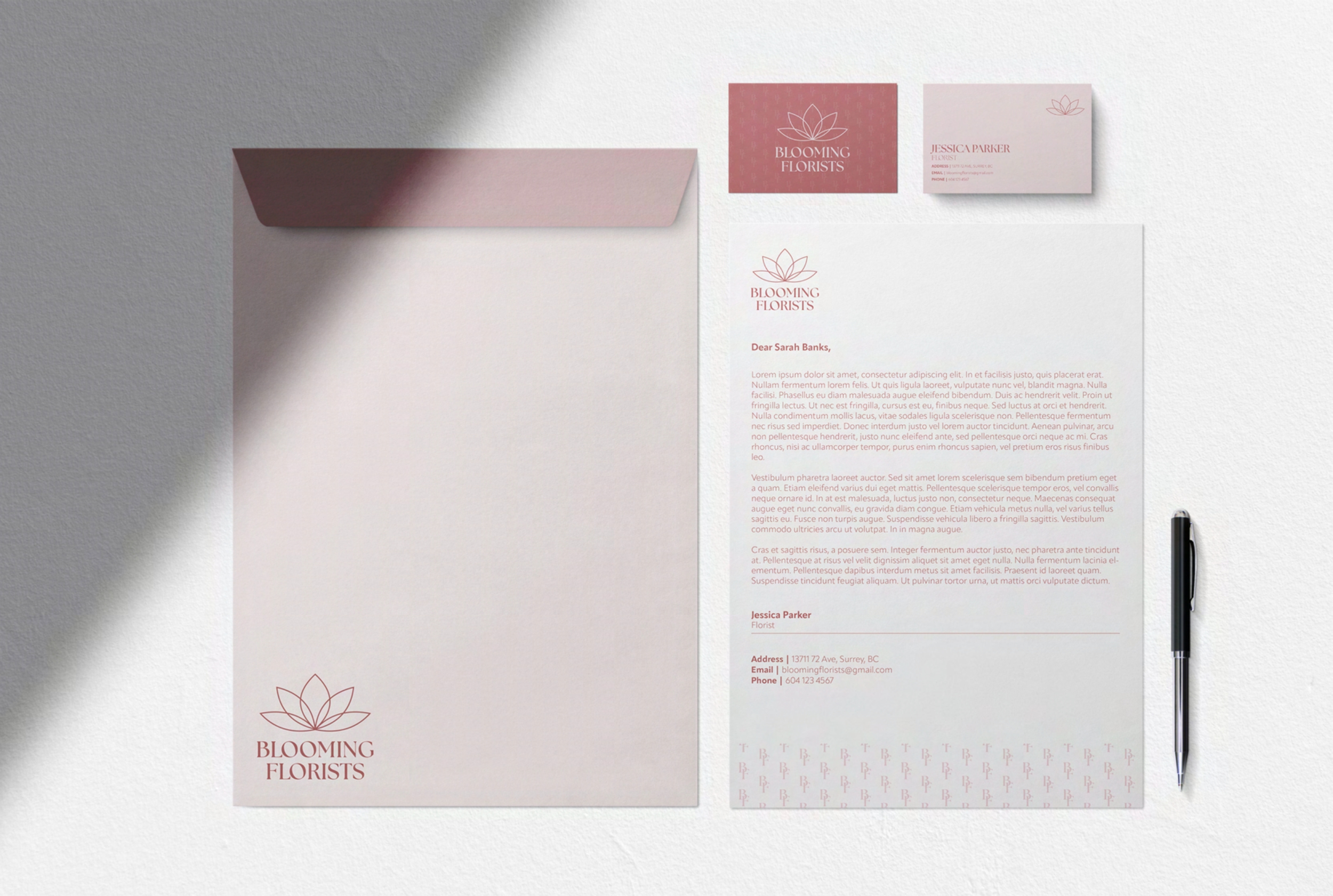
A stationary would be helpful for the brand because it allows them to send professionally formatted documents that are brand-consistent. It’s a way to further reinforce Blooming Florists brand identity.
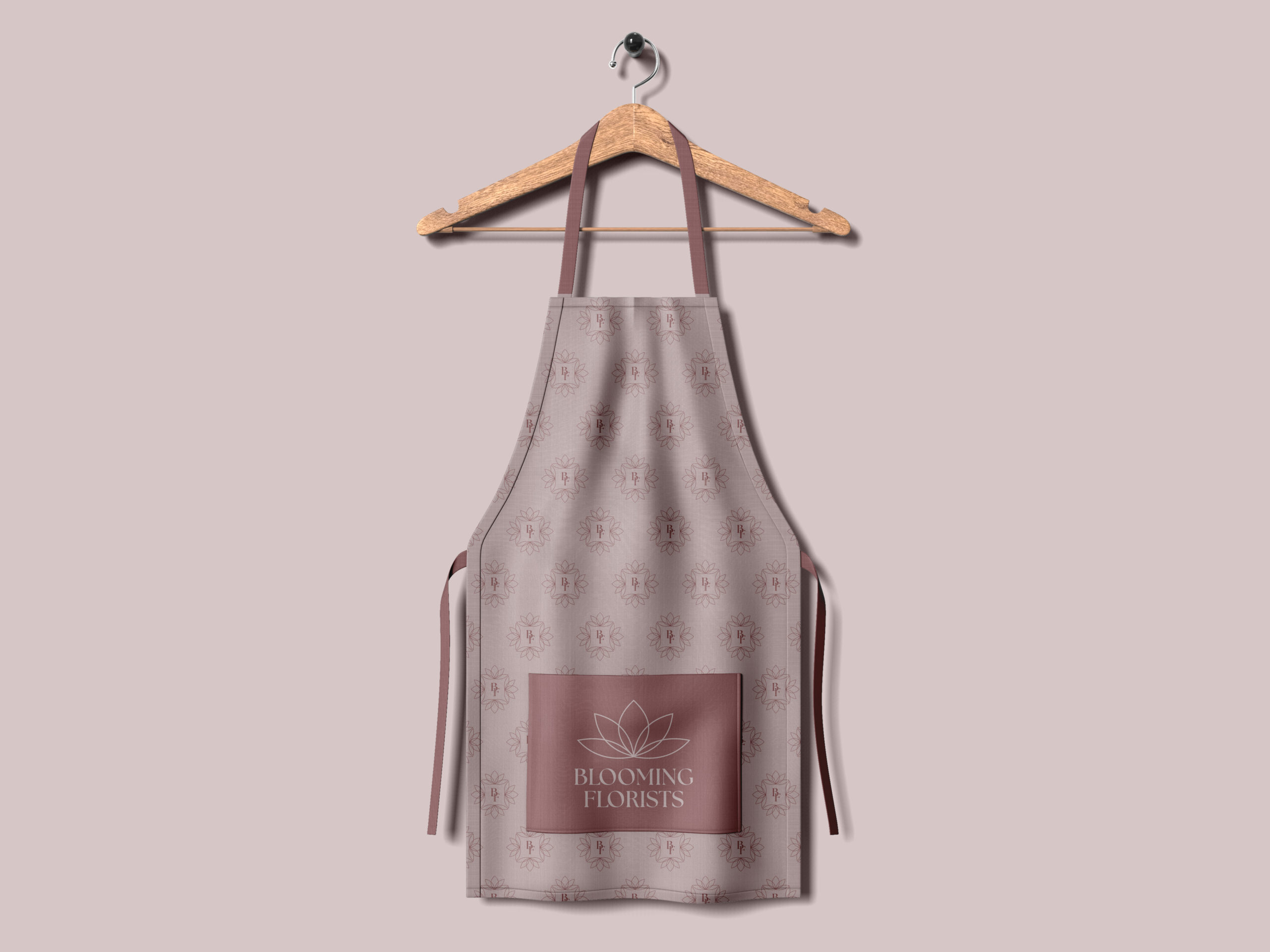
Apron
An apron was created for the employees so that they all have consistent uniforms that are functional and also brand cohesive utilizing its colours, name, logo, and patterns.
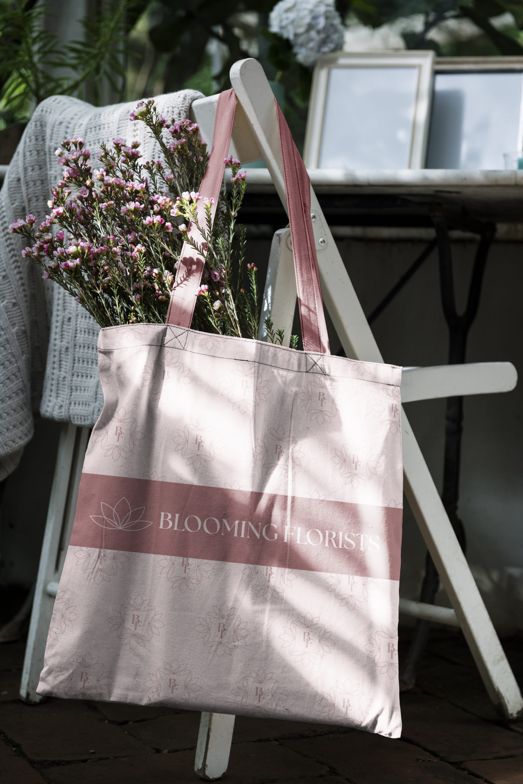
Tote
This tote bag would be given to customers that are purchasing flowers, plants, and products that aren’t arranged in any particular way. It utilizes the brands logo, colours, typography, and pattern.
Bouquet Paper
Bouquet paper is a way for the business to further express their brand identity. This pattern utilizes Blooming Florists initials “BF” which surrounds the paper.
