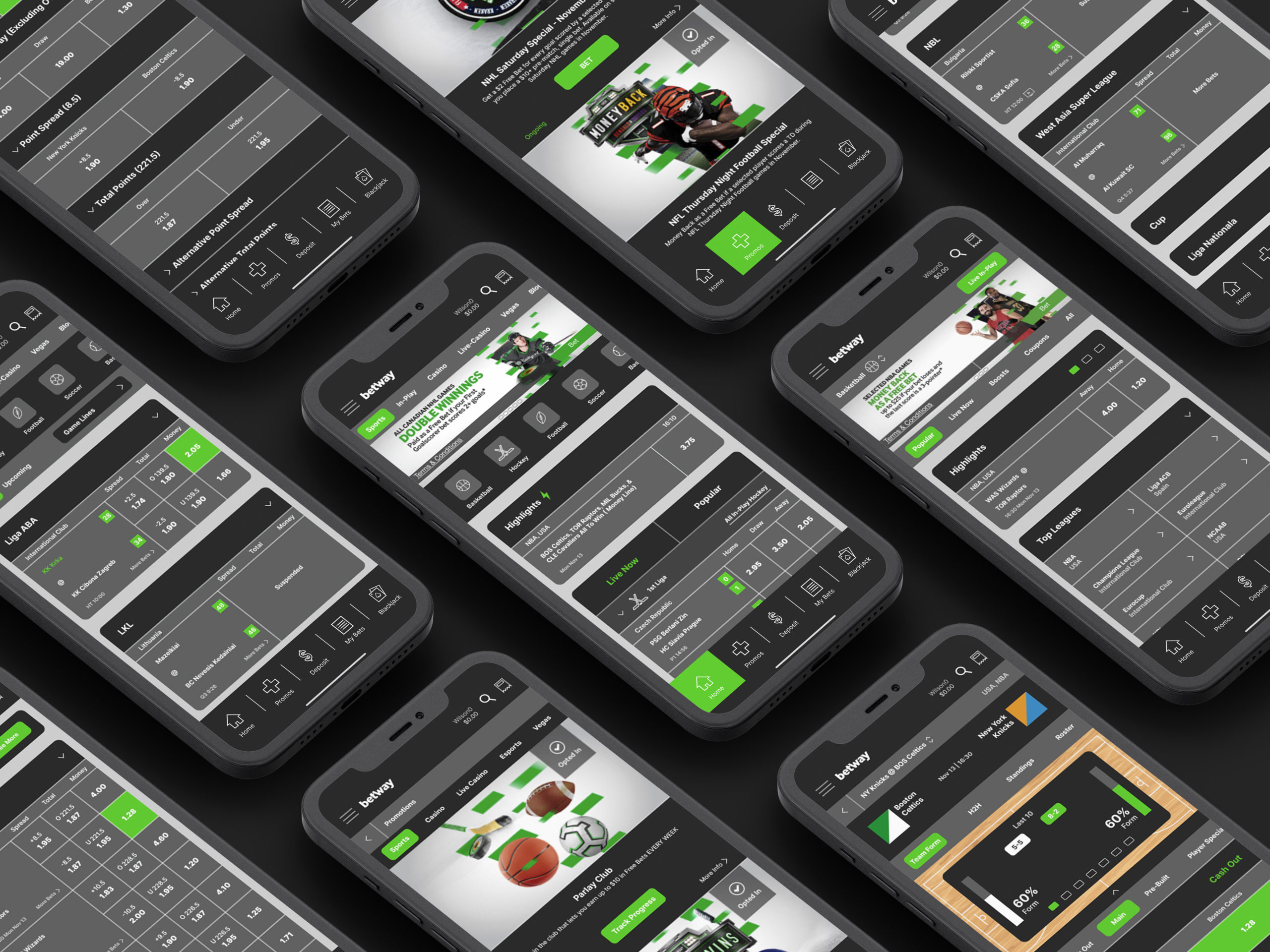
Betway Sports
Betway Sports is a sports betting app which includes a variety of different sports and games to bet on. They offer sports such as basketball all the way to biking. Their app also includes all of their other app extensions such as their live casino and esports betting. The app offers many positives in terms of the simplicity and functionality.
Categories
UX/UI
My Role
I was tasked to redesign an app to improve UI by updating its layout, contrast, and hierarchy. Things such as redesigning the apps icons, updating colour, and updating typography were all part of this project. I also was tasked to improve the UX by removing any redundancies in the apps overall layout.
Constraints
- Keeping elements that are necessary
- Matching the brands style
Fulfillment of Requirements
The decisions made throughout this project fulfilled the requirements of increasing contrast, hierarchy, and improving the overall layout. The contrast was achieved through the changes made to colour which allows the viewer to differentiate sections from the background and each other. The hierarchy was improved through updating the typography by using different weights and sizes of the typeface so that the user can differentiate the different elements throughout the app. The layout was improved by adding more white space between sections and rounding the corners of elements to give the app a softer and more approachable feel.
Logo
The logo was something that I felt personally didn’t need to be updated as it is used consistently throughout their branding. It works well in both small and large scales. It is simple, timeless, and easy to remember.
Colours
For colour, the app had an issue with contrast so I decided to keep them within the brands style, but update them and swap them around to improve contrast between elements within the app. They use many grays, blacks, and whites which makes their app feel simple, but they conflict with the viewers eye because of the lack of contrast. The green was slightly updated by brightening it to make it more vibrant and stand out from the rest of the colours used. It was used mostly for special cases such as their promos, selecting a bet, and also their buttons.
For the background colour, I used a similar tone gray to what they have currently, but added a gradation to it to make the app feel more dynamic. For the carousels and heading backgrounds, I swapped the gray they were using for a slightly desaturated black which increases contrast between the text and background. Another reason for this was because the grays they were using for their headings for the betting cards were extremely similar to what they had on the app background.
In between each section, I decided to add white lines between them to add space between the content so that it is easy for the viewer to skim through different things throughout the app. Their betting card colours were changed from white to a dark gray to differentiate the content from their headings and to match the brand’s style.

Typography
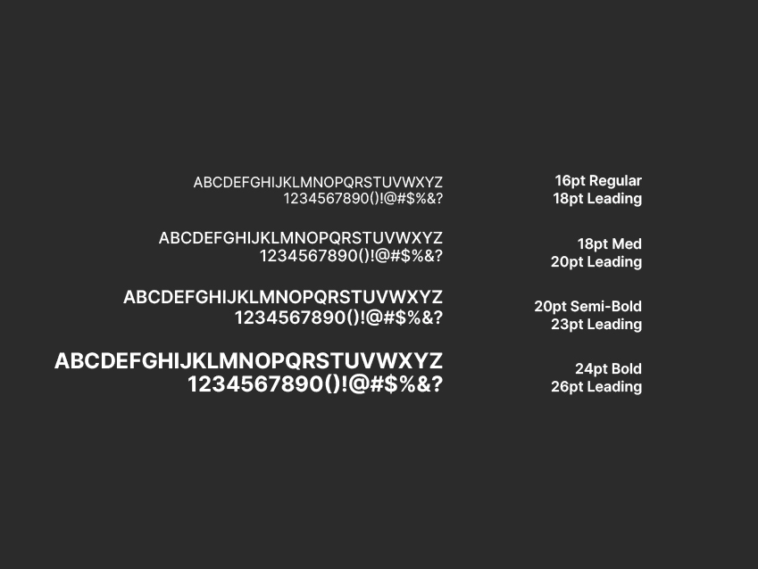
Typography was something that needed to be updated in terms of hierarchy. The app actually uses a clean and simple typeface, but use it inconsistently. Throughout their app, certain headings are lowercased and some are uppercase which makes them very inconsistent. I decided to use the typeface called Inter because it is similar to the one they have, but includes more variation in weights. I mostly used the bold weight of this typeface because it sticks out and is easy to read which is important because betting apps require elements to be fast viewing. I used the semi-bold weight for special cases such as under the betting cards to list the specific country the league is in. It was also used underneath the apps iconography because it is simple enough to see, but not too bold. The medium weight of this typeface was used throughout the footer of the app. The regular weight was used for the body copy that is underneath all the betting cards on the home page because it requires a lot of reading and the regular weight makes that easy.
UI Kit
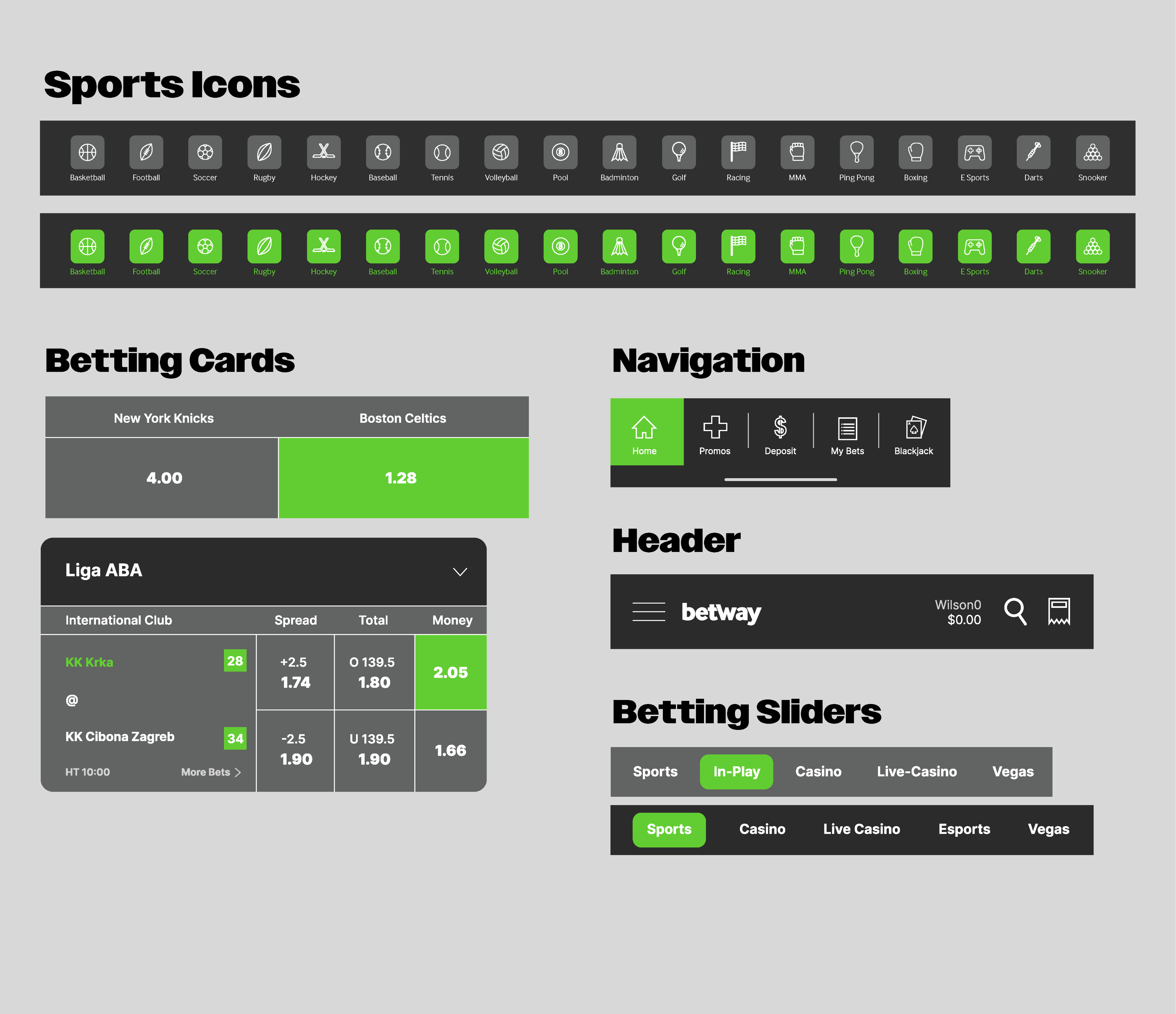
For the UI kit, I wanted to keep the elements similar to what they had, but the main thing I wanted to change was the iconagraphy. The iconography was something that needed to be updated because of the inconsistency they all have. The sports icons are extremely different from the ones they are using in their app navigation and their header. They all include many different colours which makes them different from each other. My approach was to simplify them by making them all a single colour and remove unnecessary detail.
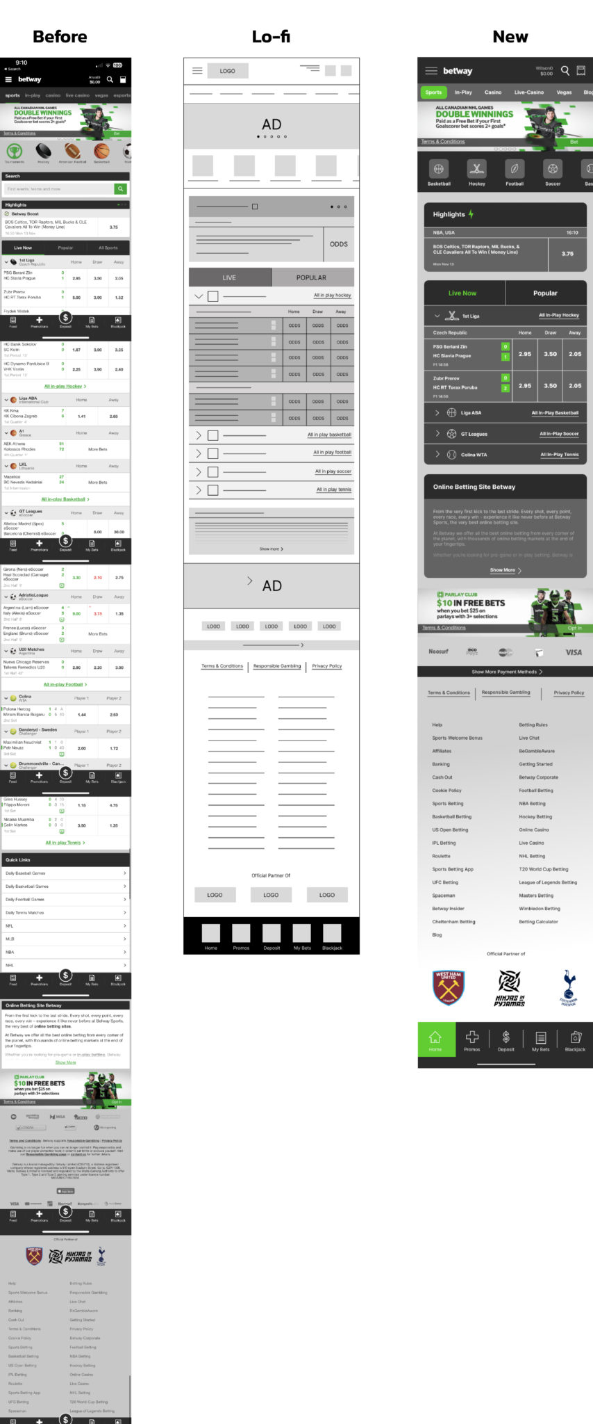
Home Screen Changes
- Search Bar: The search bar was removed from the home page because there is an icon for it within the header
- Betway Boost: The Betway Boost text was removed underneath the headings and turned into an icon to optimize space.
- League Names: League names were added underneath section headings to give the user more information about the game.
- White Space: White space was added between the sections to clearly differentiate them and to add contrast between the background and each section.
- All Sports Button: This was removed from beside the “upcoming” and live” headings because all the sports can be accessed through the top of the page.
- All In Play: The “All in Play” text was moved beside each of the sections for each sport rather than underneath to optimize space
- Quick Links: The “Quick Links” section was removed because it’s repeating the same function as what the sports slider at the top is doing.
- Terms and Conditions: This was removed from the links they have and moved beside their other policies to optimize space and remove any redundancy.
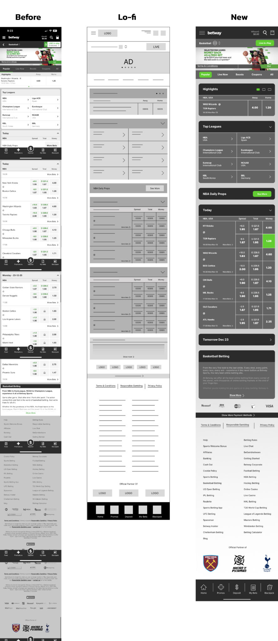
Basketball Screen Changes
- Back Arrow: The back arrow underneath the heading was removed because it has the same function as the home button I added to the nav bar at the bottom.
- Top Leagues: In the “Top Leagues” section of the page, I made it into a collapsible section to match the rest of the app and to close it if the user wishes to do so.
- Daily Props: The “NBA Daily Props” section was separated from the games because it was underneath “Spread, Total, and Money” which has nothing to do with props.
- Odds: Odds were changed in a way to match the home screen to keep consistency throughout the app.
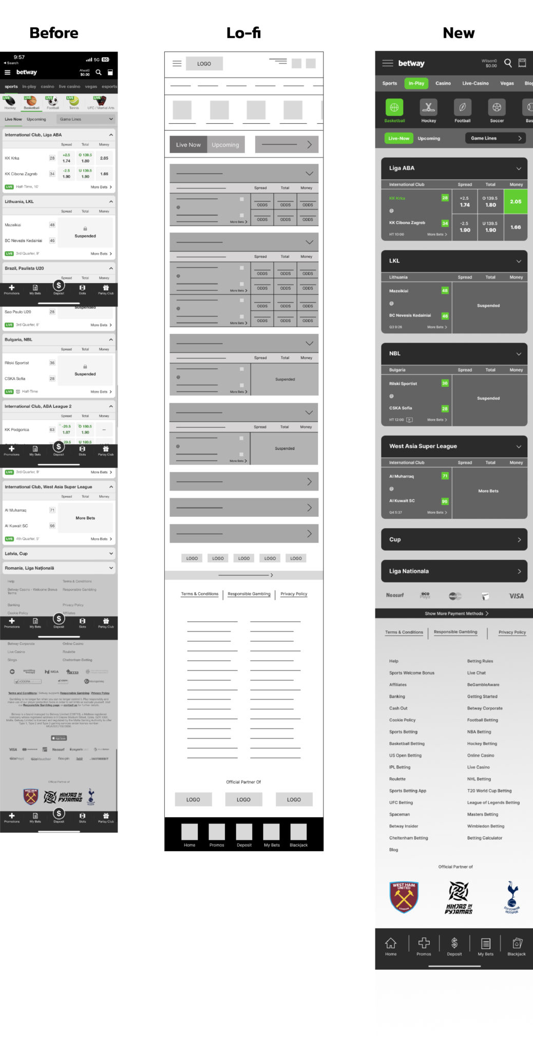
In-Play Screen Changes
- Section Headings: League names and countries were separated from each other to match the basketball sections. Rather than having “Today” or another date as the heading, I put the league name so that is easy recognizable. The country is underneath this so that if the user opens the carousel, they would have more info on the league.
- Live Icon: The “Live” icon was removed from underneath the team names in the sections because the user can already see that they are on the in-play screen and it says “Live Now” on top of all the games.
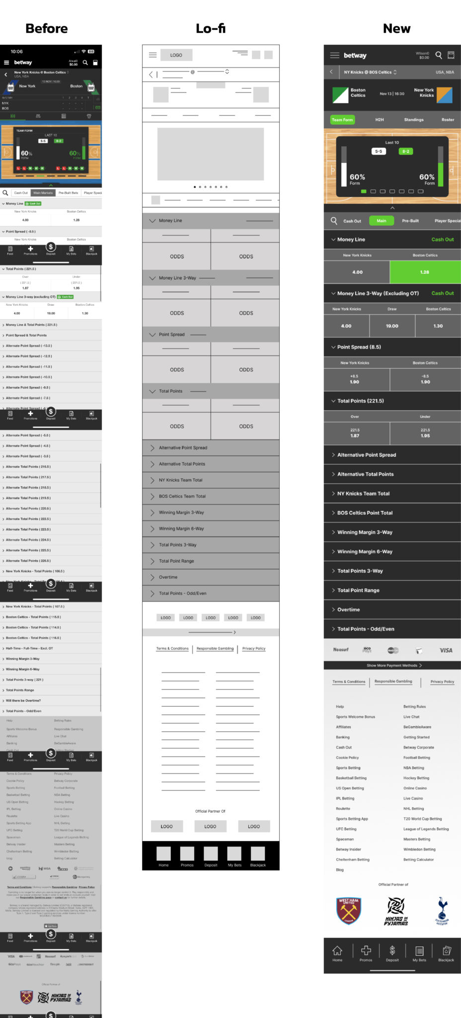
In-Game Screen Changes
- Team Names: The team names were abbreviated underneath the heading to optimize space. The full names of the teams were added rather than just having just the city name like “Boston” or “New York” to give the user more information on the team.
- Quarter Scores: The quarter scores section was removed from the page because the game is not live yet.
- Icons: Icons were changed to the text underneath the full team names because the user can’t tell what they are because of their scale.
- Cash Out: The cash out icon was changed to text because of the scale and moved to the right side of the section to give space between the heading and the “Cash Out”.
- Alternate Bets: Every alternate bet they have was moved into their specific categories such as “Alternative Point Spread” or “Alternative Point Total” to optimize space.
Promo Screen Changes
- More Info: The text underneath each ad was removed to reduce the amount of text on the page and it can be added to the “More Info” link at the bottom right.
- Ads: Some of the ads were removed because they don’t fall under the “Sports” category, but rather their casino category which isn’t selected at the top of the screen.

Screen Mockups

